

TECHNIQUE FOR ANALYZING THE EFFECTS OF REGULATING VARIABLES USING GRAPHICS
The technique of analyzing the influence of moderator variables using graphs is used to determine the degree of influence of the moderator variable on the relationship between the dependent variable and the independent variable.
When using this technique, we will create a graph to show how the moderator variable affects the relationship between the dependent variable and the independent variable (cause variable). This graph will tell us whether the moderating variable has a positive or negative effect on the relationship between variables.
First, we need to determine whether a moderating variable in the model plays a moderating role in the relationship it governs in the model. By analyzing the influence of the interaction term on the dependent variable, if the interaction term has a statistically significant effect on the dependent variable, we can conclude that the moderating variable really plays a role. role in regulating the relationship that governs the research model.
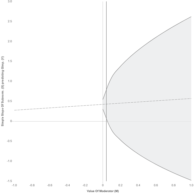
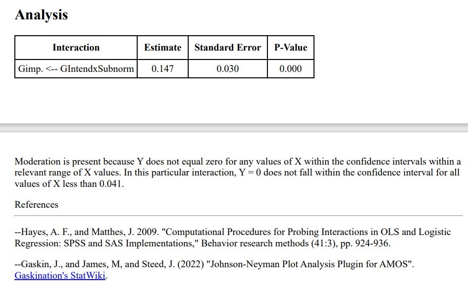
When a variable plays a moderating role, we will continue the story of analyzing the influence of the moderating variable in the research model through visual charts. We will have two types of graphs to evaluate, the first is spotlight analysis, and the second is floodlight analysis (Spiller et al., 2013). We will present the typical form as spotlight. Floodlight form, also known by the author’s name Johnson-Neyman, we will guide you to draw this J-N graph using the plugin included in the AMOS application. To learn more about this type of floodlight, you should refer to the article by Spiller and colleagues (2003).
Spiller and colleagues (2003) recommend using floodlight graphs to evaluate the influence of moderator variables when writing reports, because floodlight graphs provide specific areas of influence of the moderator variable of interest. details through determining the J-N point (Johnson-Neyman point). However, in my personal opinion, this technique is relatively difficult to draw manually, requiring macro support. Therefore, in my opinion, the spotlight technique is still the most suitable choice for applied research, because we only need to determine the tendency to regulate the cause-and-effect relationship in the research model from which we can have solutions. appropriate management solutions.
Next, we will guide you through techniques for analyzing the influence of moderating variables in the SEM model using spotlight graphs.
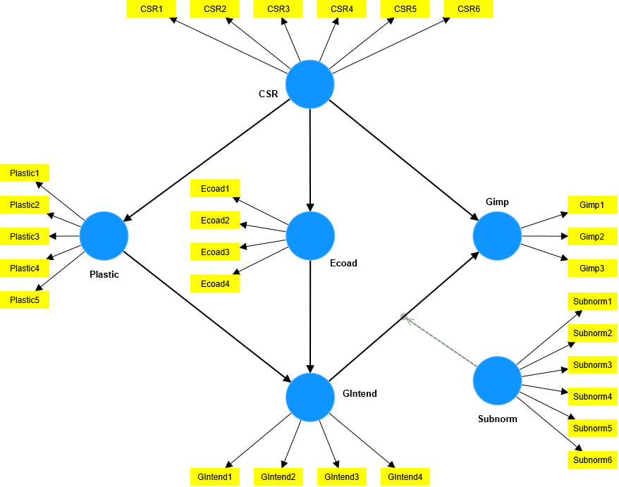
First, we establish a regression equation of the moderating variable on the cause and effect relationship. Here, we make a visual example for you to easily visualize. We will have a model like sample data Data23070102, the model runs with SmartPLS 4.0.9.2 as follows:
The results of running boostrap are as follows:
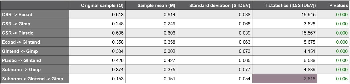
From this result, the regression equation of the moderating variable is written as follows:
Gimp = 0.304GIntend + 0.374Subnorm + 0.153SubnormGIntend (*)
We will draw 3 straight lines corresponding to the 3 smallest (-1SD), average (0), and maximum (+1SD) values of the regulatory variable (Subnorm), where SD is the standard deviation. Normally, we should use normalized data, so the SD for normalized data would be 1.
Equation corresponding to Subnorm = -1SD = -1:
() → Gimp = 0.304GIntend + 0.374(-1) + 0.153(-1)*GIntend
→ Gimp = -0.374 + 0.151*Gintend (1)
Equation corresponding to Subnorm = 0:
() → Gimp = 0.304GIntend + 0.374(0) + 0.153(0)*GIntend
→ Gimp = 0.304*Gintend (2)
Equation corresponding to Subnorm = +1SD = +1:
() → Gimp = 0.304GIntend + 0.374(+1) + 0.153(+1)*GIntend
→ Gimp = 0.374 + 0.457*Gintend (3)
From the 3 linear equations (1), (2) and (3) we will draw a Spolight graph (by giving Gintend values of -1 and +1 respectively) as follows:
(Vẽ bằng excel)
Below is the spotlight graph exported from SmartPLS
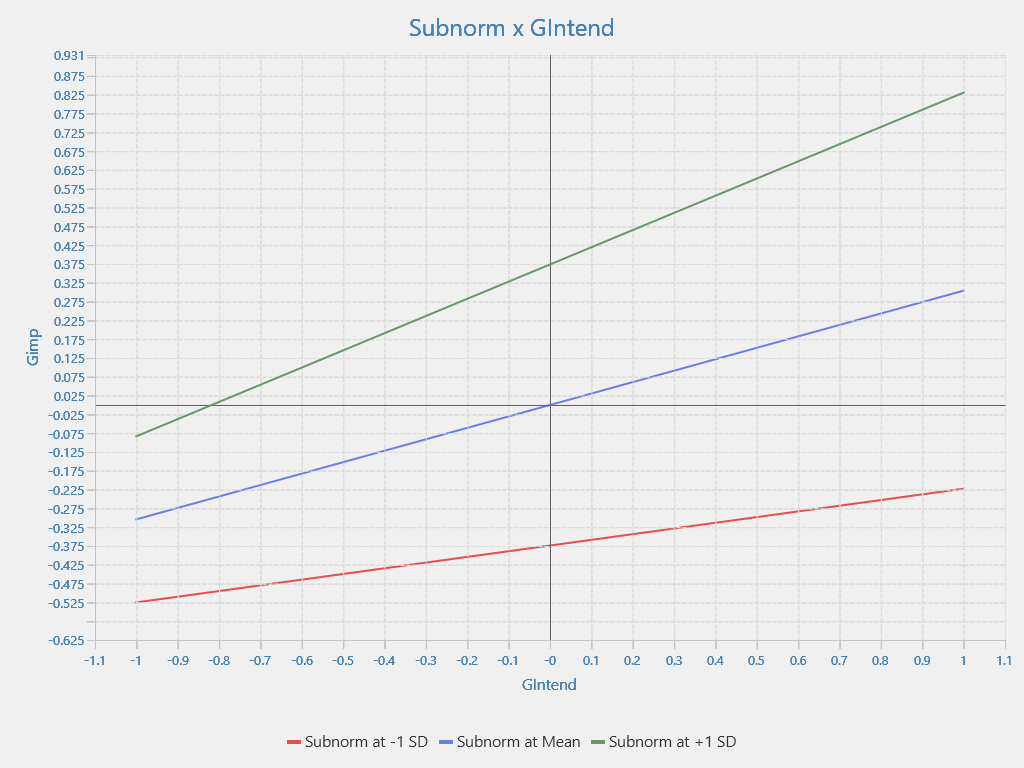
Thus, we have basically drawn a spotlight graph for moderating variable analysis in the SEM model.
Using mathematical knowledge, based on the slope of each line, analyze the regulation of the moderating variable in the SEM model. Note, the slope of a linear line is its slope. In the example above, the slope of line (1) is 0.151, of line (2) is 0.304, and of line (3) is 0.457. The free terms in linear equations are called stationarity coefficients (also known as free constants). In terms of geometric meaning, they represent the translational distance from one line to the other.
Here, we can see that Subnorm has a positive regulatory role in the relationship between GIntend and Gimp. If Subnorm is stronger, the influence coefficient of GIntend on Gimp will increase. And specifically how to increase it, the problem of moderating variable analysis will not help clarify. To clarify, the only way we think is to switch to MGA (multigroup) analysis, and the story will become more complicated.
We will stop the spotlight analysis story here. Now we will guide you to draw J-N graphs using the plugin in AMOS.
To install this plugin, please refer to our article on the sharing section at amosleminh.com.
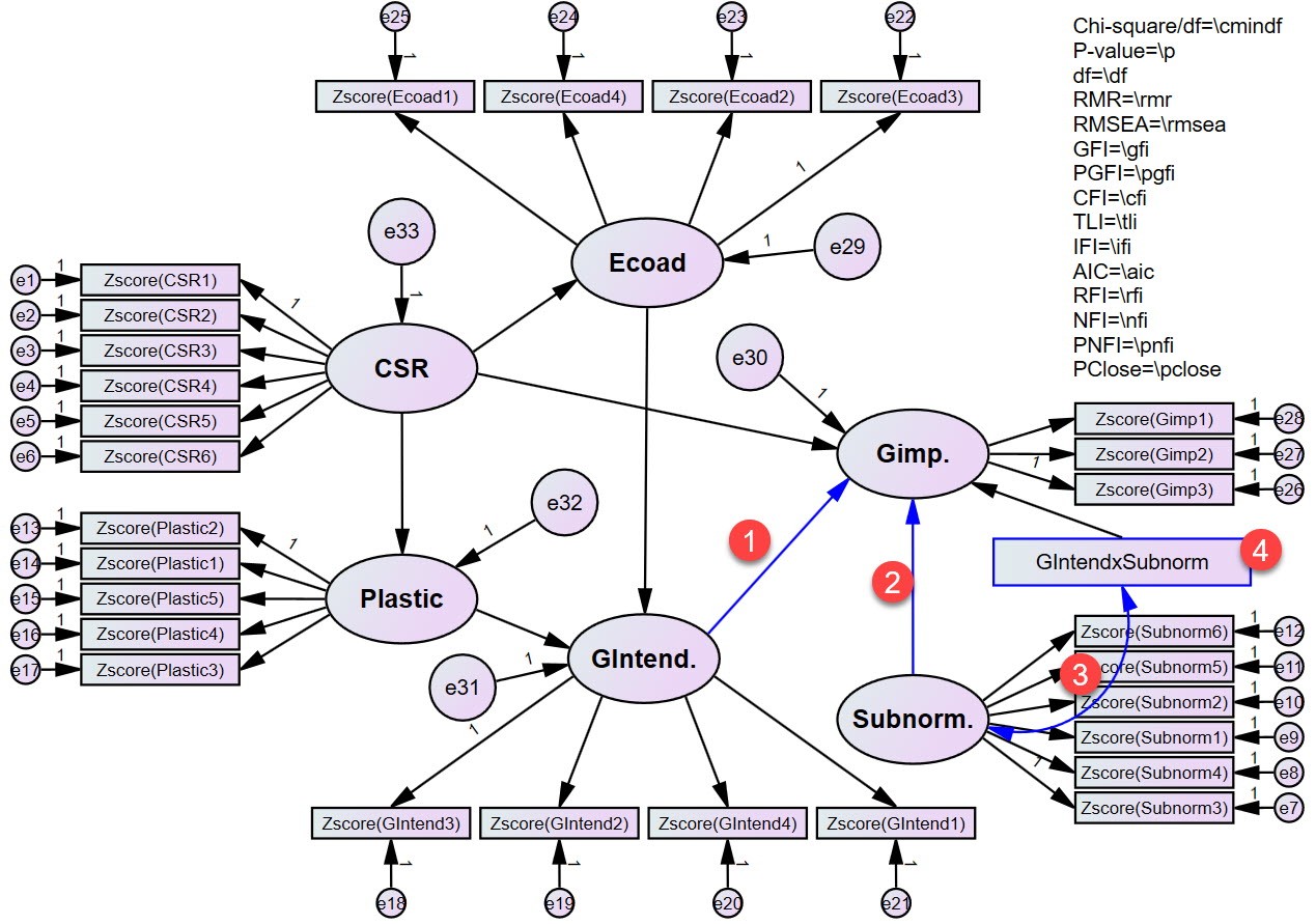
Before running the J-N plot plugin, we will have to select the path from the independent variable to the dependent variable, the path from the moderator variable to the dependent variable, the path between the moderator variable and the interaction cluster, and select the interaction cluster as shown below.
Then run the J-N plot plugin, the floodlight chart results as shown below.
References
Frazier, P. A., Tix, A. P., & Barron, K. E. (2004). Testing moderator and mediator effects in counseling psychology research. Journal of Counseling Psychology, 51(1), 115.
Fritz, M. S., & Arthur, A. M. (2017). Moderator variables. In Oxford research encyclopedia of psychology.
Hayes, A. F. (2022). Introduction to mediation, moderation, and conditional process analysis: A regression-based approach. Guilford publications.
Kraemer, H. C., Wilson, G. T., Fairburn, C. G., & Agras, W. S. (2002). Mediators and moderators of treatment effects in randomized clinical trials. Archives of General Psychiatry, 59(10), 877–883.
Spiller, S. A., Fitzsimons, G. J., Lynch Jr, J. G., & McClelland, G. H. (2013). Spotlights, floodlights, and the magic number zero: Simple effects tests in moderated regression. Journal of Marketing Research, 50(2), 277–288.
Please contact Le Minh Data Services in case you need more in-depth analysis of regulatory variables, including using spotlight or floodlight graphs, we support.
Sincerely thank you brothers and sisters.